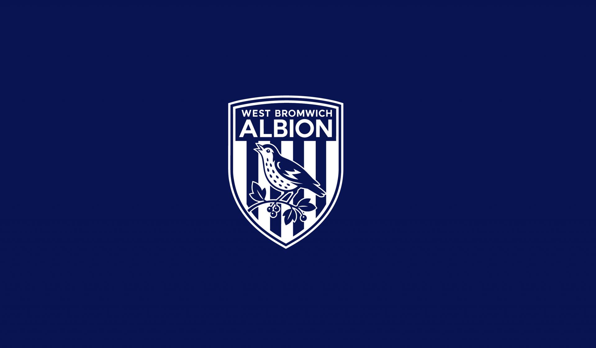
Project Overview / Independent Proposal
HERITAGE, REFINED.
ALBION, REDEFINED.
West Bromwich Albion already owns a distinctive visual language: the Throstle, the Hawthorn, Navy & White stripes and more than a century of club memory. This proposal does not attempt to replace that heritage. It asks how the same story can become clearer, stronger and more flexible across today’s stadium, kit, merchandise and digital environments.
새로운 상징을 만드는 작업이 아니라, 이미 클럽 안에 존재하는 강력한 헤리티지를 발견하고 오늘날의 축구 문화와 미디어 환경에 적합하도록 더 명확하고 일관된 하나의 아이덴티티로 재구성하는 데서 시작한 제안입니다.
Throstle, Hawthorn, stripes and the club name remain the foundation.
Complexity is removed only where it improves recognition and consistency.
The crest, symbol, stripes and wordmark operate together across every touchpoint.
Born in West Bromwich. Carried forward as Albion.
The club that became West Bromwich Albion was formed in West Bromwich in 1878. Its earliest pioneers were known as West Bromwich Strollers before the club took on the Albion name. From that local beginning, the club grew with its community and built a football identity inseparable from place, supporters and matchday culture.
The central question is therefore not how to reinvent Albion, but how a club born in West Bromwich can carry its history and symbols into the next generation while keeping Albion as its clearest shared identity.
It was how the heritage was expressed.Core rebranding premise
A symbol of Albion — preserved through a clearer silhouette.
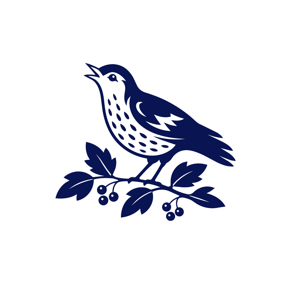
The Throstle — a Black Country term for the song thrush — has been associated with Albion since the nineteenth century and remains one of the club’s most direct identifiers. Rather than turning the bird into a generic sports icon, the proposal keeps the recognisable upward posture, spotted chest, wing character and relationship with the branch while reducing unnecessary visual noise.
새는 단순한 마스코트가 아니라 Club / Team / Supporters / Albion을 하나로 연결하는 역사적 상징입니다. 디테일을 덜어내되, 처음 보는 순간에도 ‘Albion의 새’로 읽히는 자세와 실루엣은 유지합니다.
The club standing on its home.
The Hawthorns has been Albion’s home since 1900, and the hawthorn beneath the Throstle creates a rare relationship between emblem and place. Removing it would make the mark simpler, but also less specific. The proposal therefore keeps the Hawthorn while reducing the number of leaves, berries and small details so the idea remains legible at every scale.
Throstle이 Club을 의미한다면 Hawthorn은 Home을 의미합니다. 두 상징이 함께 있을 때 비로소 West Bromwich Albion이라는 장소성과 클럽의 이야기가 완성됩니다.
The historic bird becomes the clearest sign of Albion itself.
The tree links the identity directly to The Hawthorns and its place.
Club and home remain one continuous story rather than separate graphic devices.
More than colour. A matchday memory.
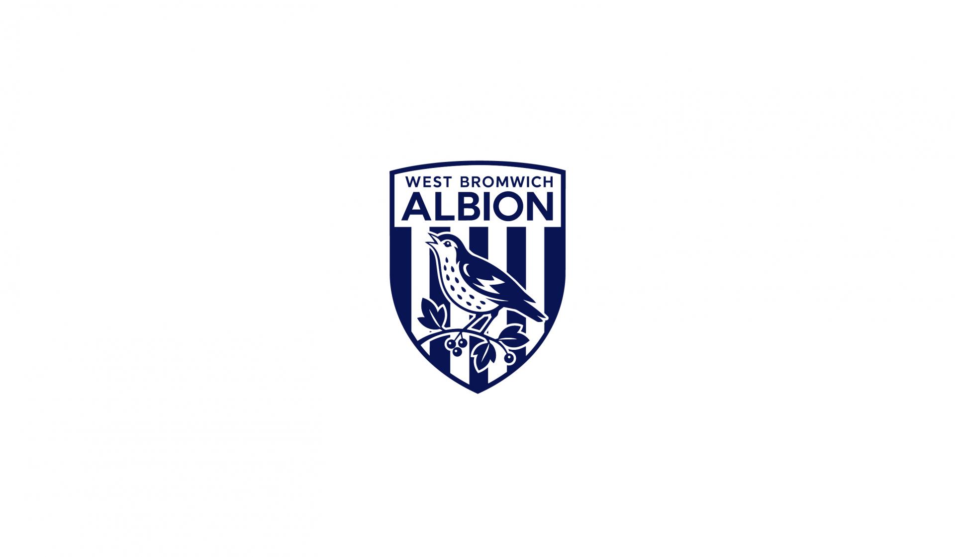
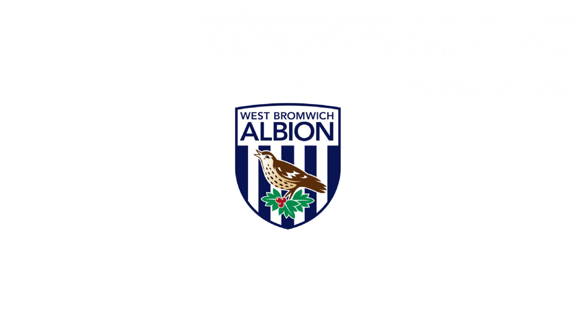
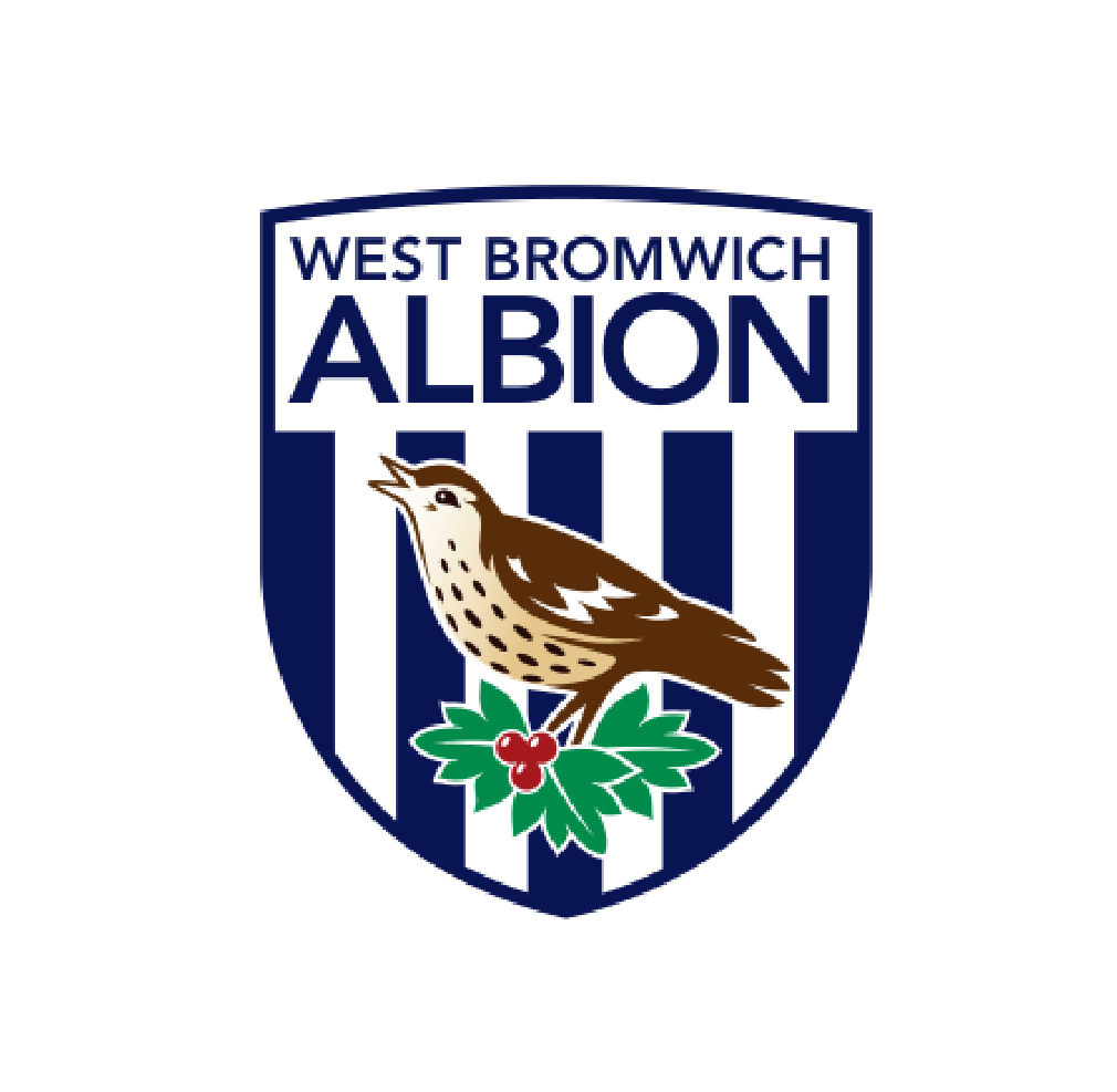
Navy and white stripes are among Albion’s strongest visual assets. Instead of adding a new palette to signal modernity, this proposal strengthens what supporters already recognise. The previous naturalistic brown, green and red details are removed from the core identity so the crest and secondary mark can operate as a unified Navy & White system.
스트라이프는 단순한 그래픽 패턴보다 Home Kit / Match Day / Albion을 동시에 떠올리게 하는 기억에 가깝습니다. 새로운 컬러를 만드는 대신 기존 컬러의 존재감을 더 강하게 사용하는 방향입니다.
Primary identity, typography, stadium graphics and high-recognition applications.
Contrast / Modernity / Space
Keep the story. Change the way the story performs.
The existing crest contains meaningful history, but a highly detailed, multi-colour emblem becomes harder to control as the club moves between a shirt badge, mobile icon, broadcast graphic, social avatar, stadium sign and merchandise mark. The opportunity is not to make Albion look less historic — it is to let that history remain recognisable in more environments.
Rich story, limited flexibility.
- Multiple naturalistic colours
- Detailed bird illustration
- Complex Hawthorn construction
- Detail loss at small sizes
- One crest carrying every role
Same story, clearer hierarchy.
- Navy / White core system
- Clearer Throstle silhouette
- Reduced Hawthorn detail
- Improved small-scale recognition
- Primary and secondary identities
KEEP THE STORY.
REDUCE THE FORM.
Preservation through Simplification is the central strategy. Simplification is not used to remove meaning. It is used to make meaning easier to recognise, reproduce and remember.
형태를 줄이는 이유는 트렌디하게 보이기 위해서가 아니라, 의미가 더 명확하게 전달되도록 하기 위해서입니다. 역사적 자산을 계승하면서도 오늘의 축구 브랜드가 요구하는 인지성과 확장성을 동시에 확보합니다.
Albion의 역사적 상징과 팬이 기억하는 구조를 계승합니다.
불필요한 색과 세부 묘사를 줄여 형태의 핵심을 남깁니다.
작은 크기에서도 즉시 WBA로 인식되는 실루엣을 만듭니다.
유니폼, 경기장, 디지털과 굿즈에서 동일하게 작동하도록 합니다.
Clearly new. Unmistakably Albion.
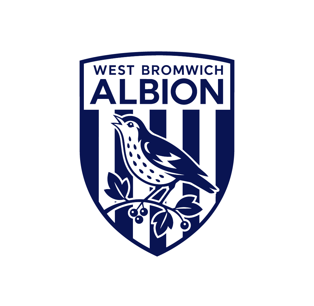
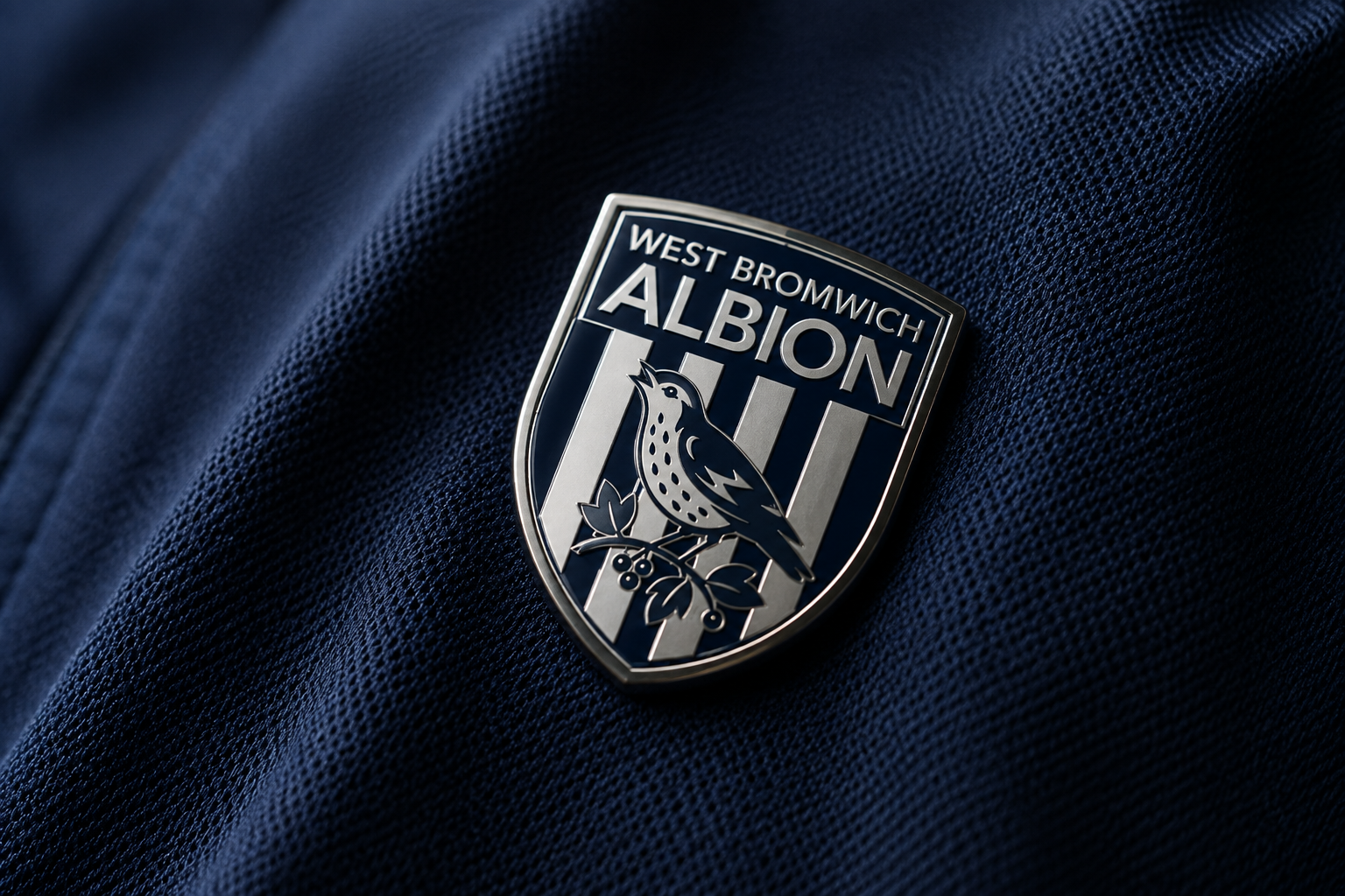
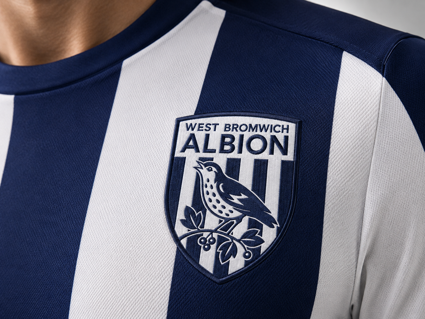
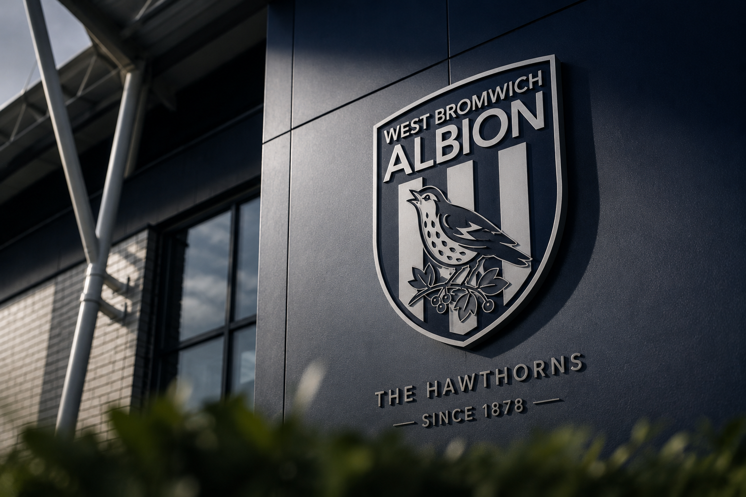
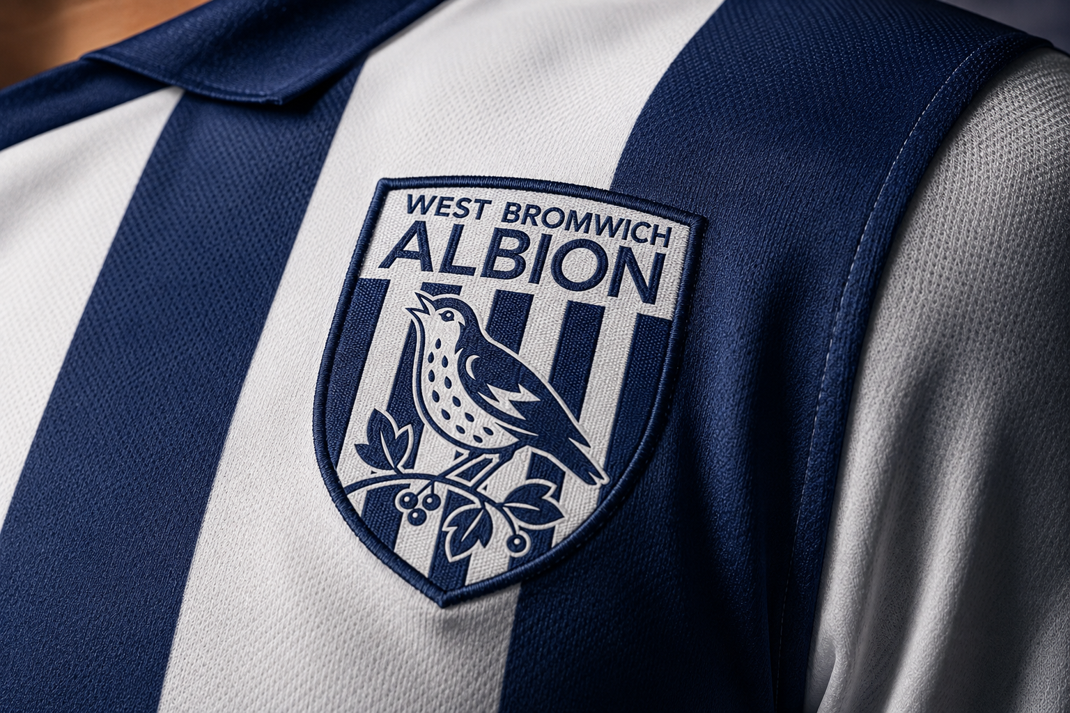
The proposal retains the shield, WEST BROMWICH / ALBION naming, Throstle, Hawthorn and Navy & White stripes. The change happens in proportion, line weight, colour hierarchy and illustration detail. The goal is a crest that feels renewed without breaking the recognition built by the club’s history.
The recognisable architecture of the club badge remains visible.
Home and kit heritage remain embedded in the crest.
Fewer colours, cleaner illustration and stronger balance improve performance.
Crest represents the Club.
Throstle represents the Culture.
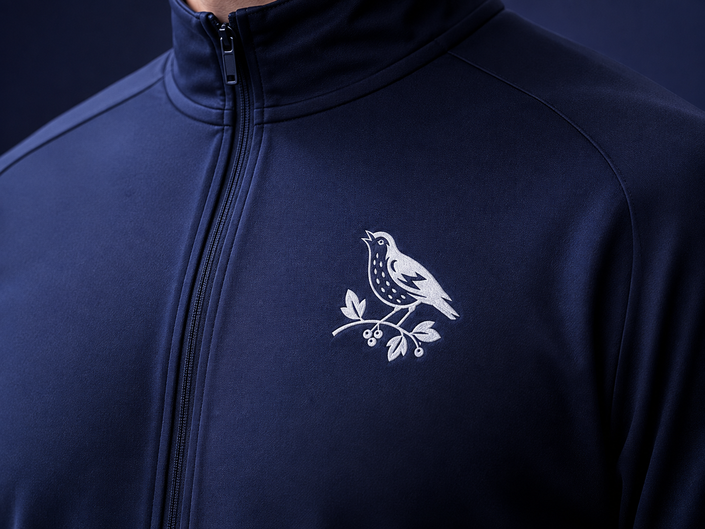
A football club no longer communicates through a crest alone. The Throstle and Hawthorn are therefore separated into a secondary mark that can carry Albion’s identity in more informal, expressive and culture-led moments — without replacing the official crest.
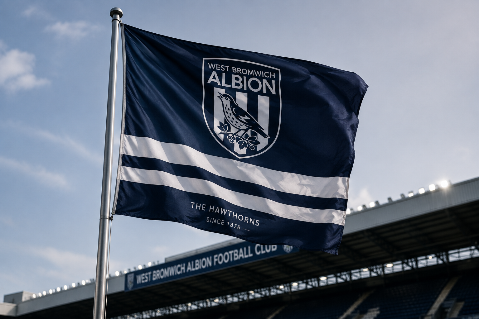
공식성과 전통을 담당하는 Crest와, 훈련복·굿즈·소셜·사인·플래그 등에서 더 자유롭게 작동하는 Throstle Mark를 분리하면 하나의 로고가 모든 역할을 떠안지 않아도 됩니다.
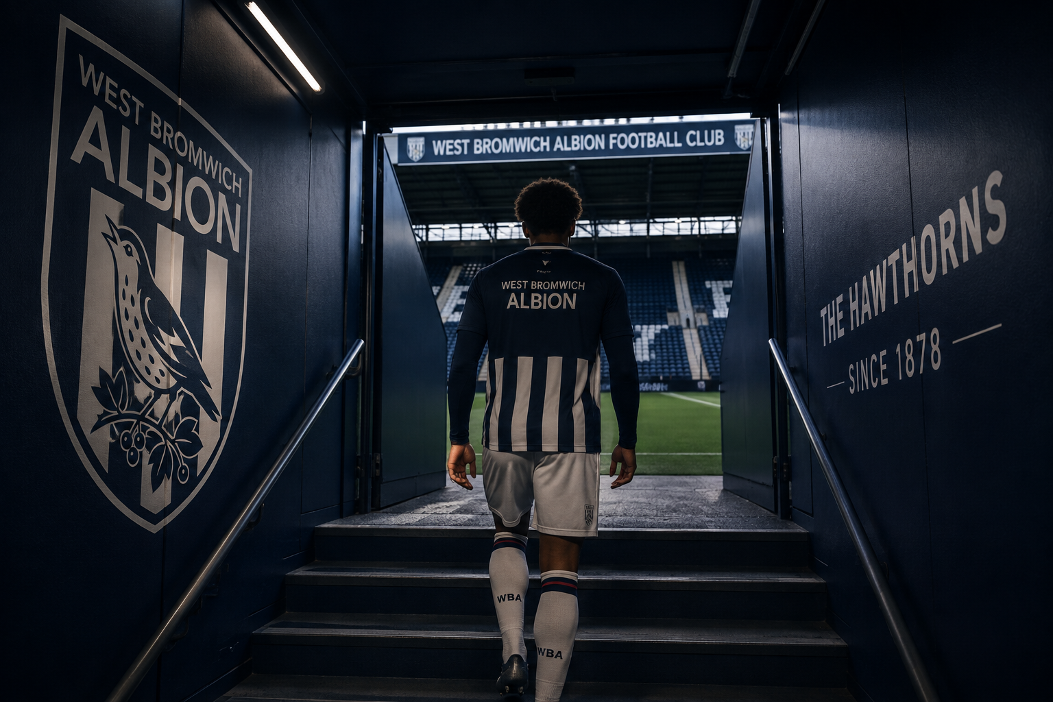
Used where authority, competition and formal representation matter most.
- Match Kit
- Stadium
- Official Communications
- Competition
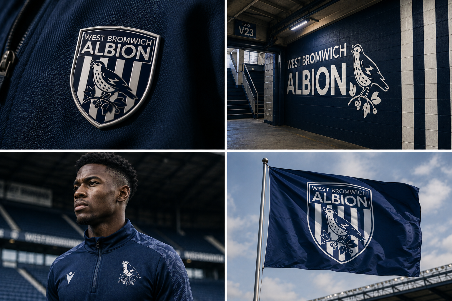
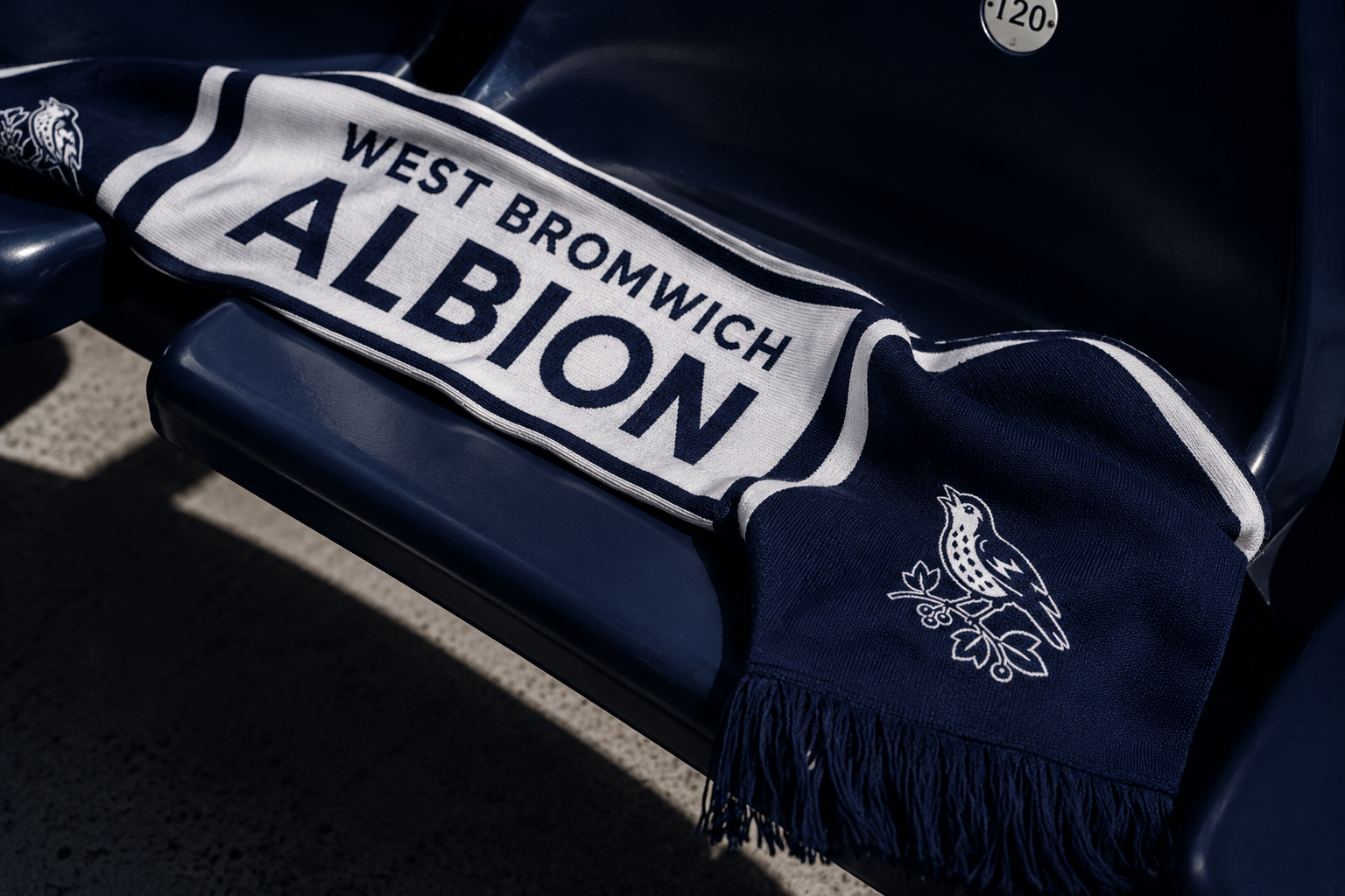
Used where club culture needs a simpler, more flexible and recognisable sign.
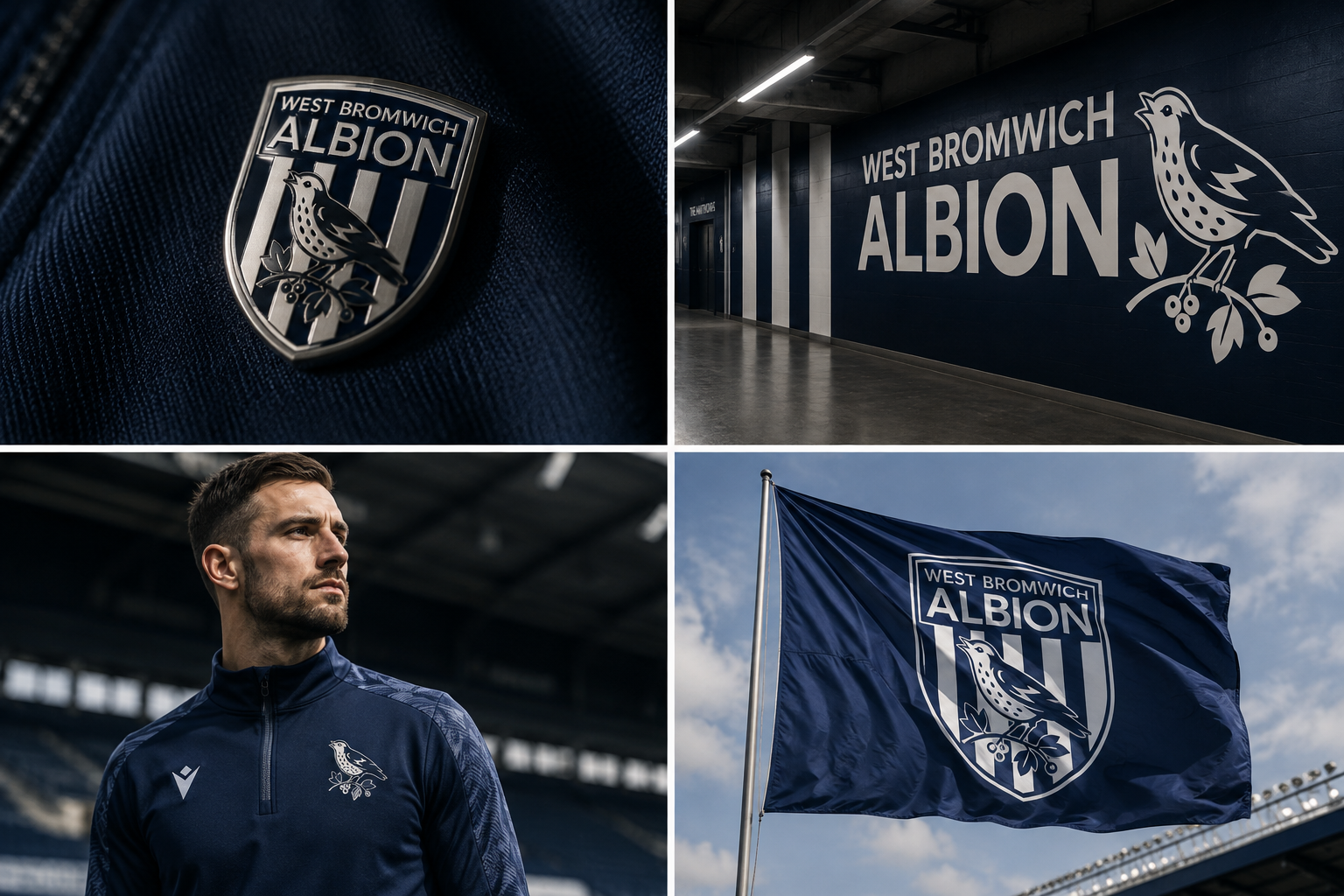
- Training Wear
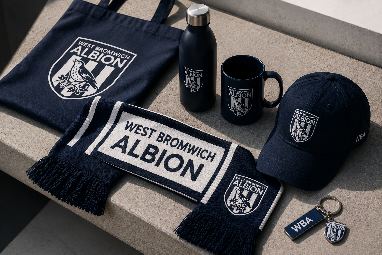
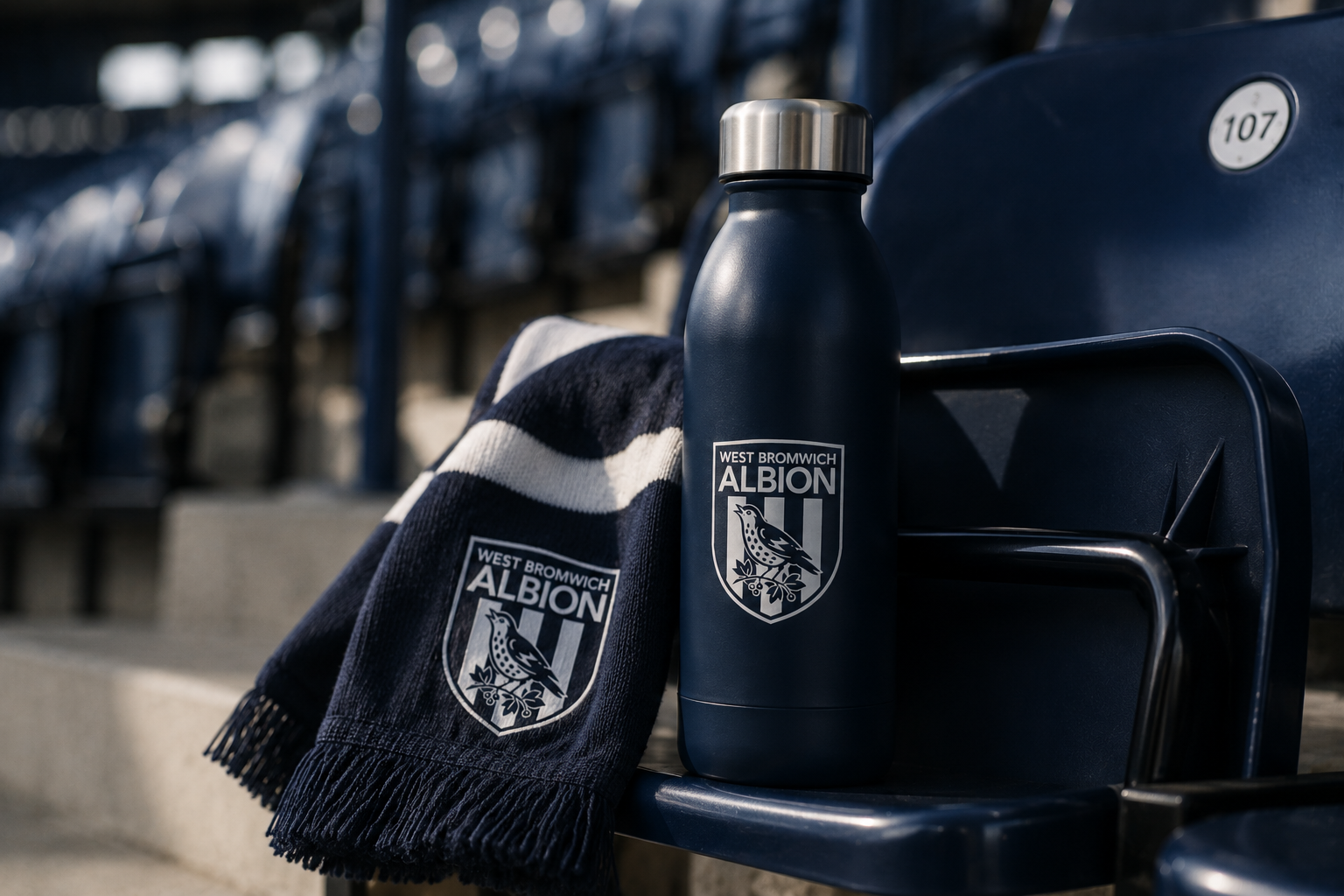
- Merchandise
- Social Media
- Signage
- Flag
- Pattern
From one crest to one club identity system.
ALBION is treated as a verbal asset as strong as the graphic marks. Together, Crest / Throstle / Stripes / Albion create a system in which each element has a clear role and can appear independently without losing the connection to the club.
West Bromwich Albion이라는 긴 이름 가운데 팬과 클럽을 가장 직접적으로 연결하는 단어인 ALBION의 존재감을 강화합니다. 경기장에서는 ALBION 하나만으로도 충분히 클럽을 말할 수 있도록 시각적·언어적 자산을 함께 구축합니다.
공식적인 클럽의 얼굴.
클럽을 상징하는 가장 강한 아이콘.
WBA를 즉시 떠올리게 하는 시각적 리듬.
팬과 클럽을 연결하는 가장 강력한 이름.
A renewed identity for Albion.From crest to club identity
Designed to live beyond the badge.
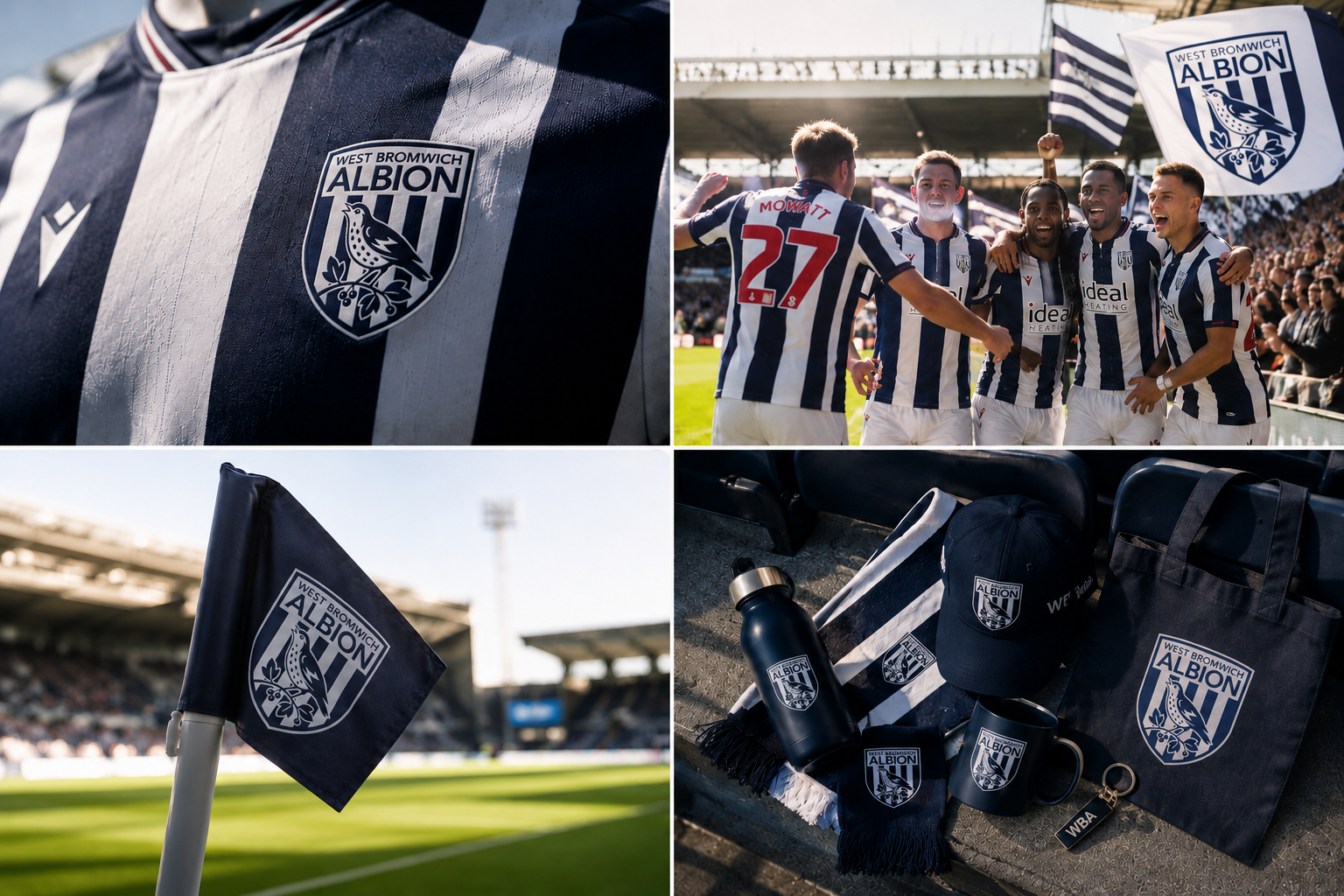
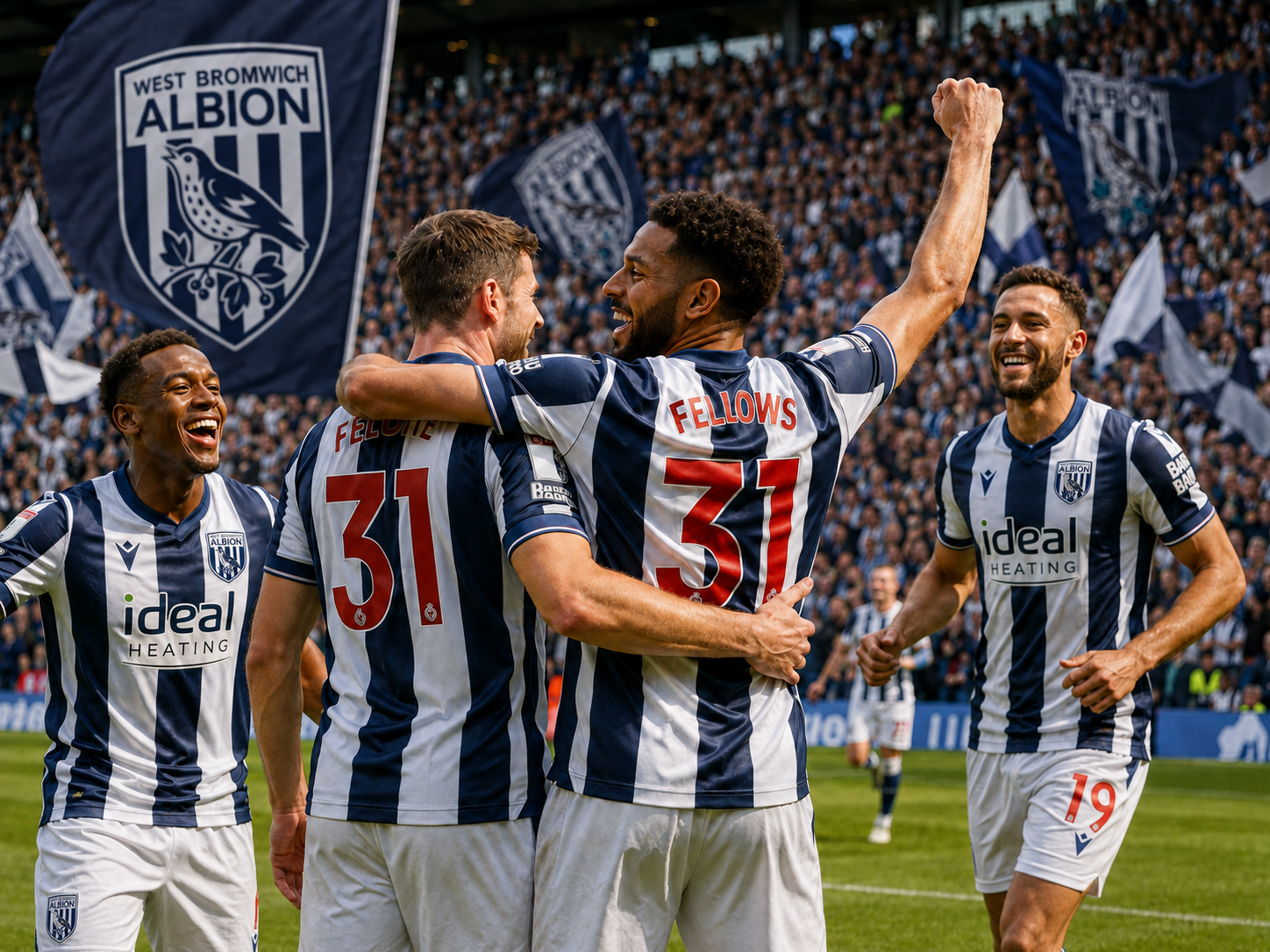
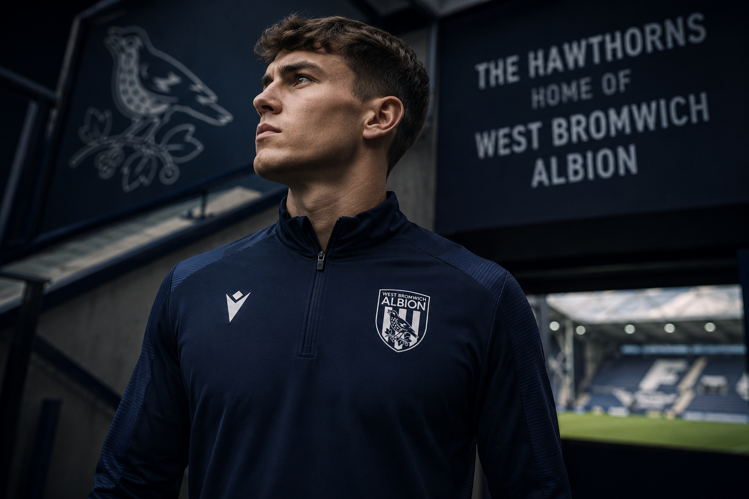
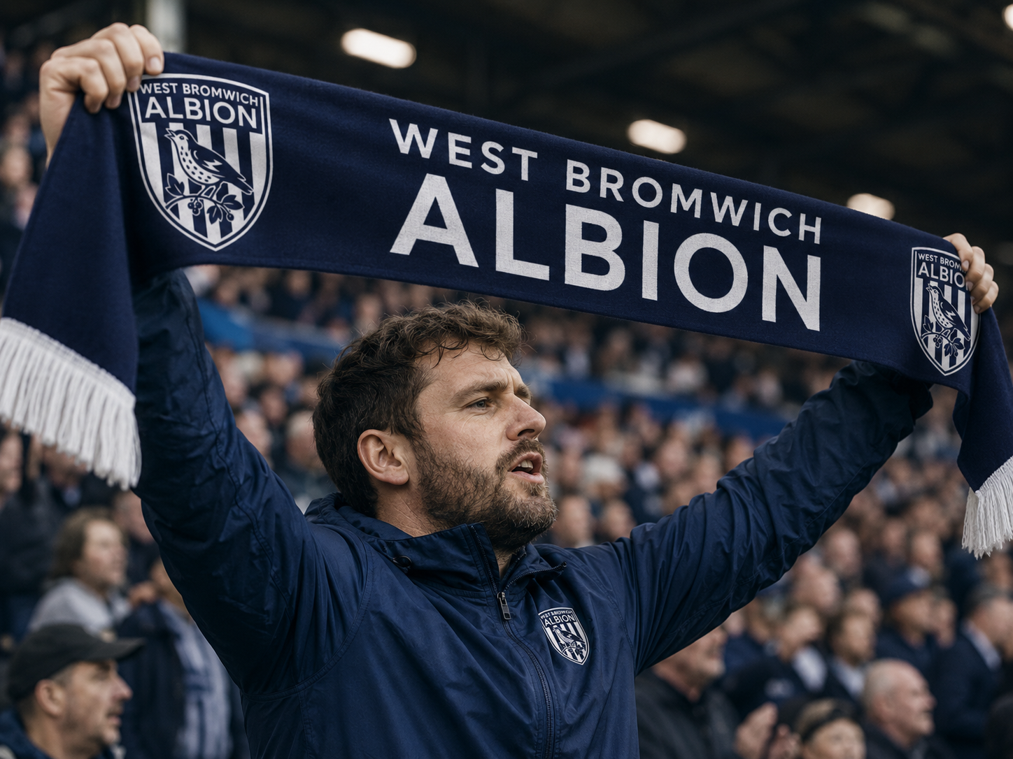
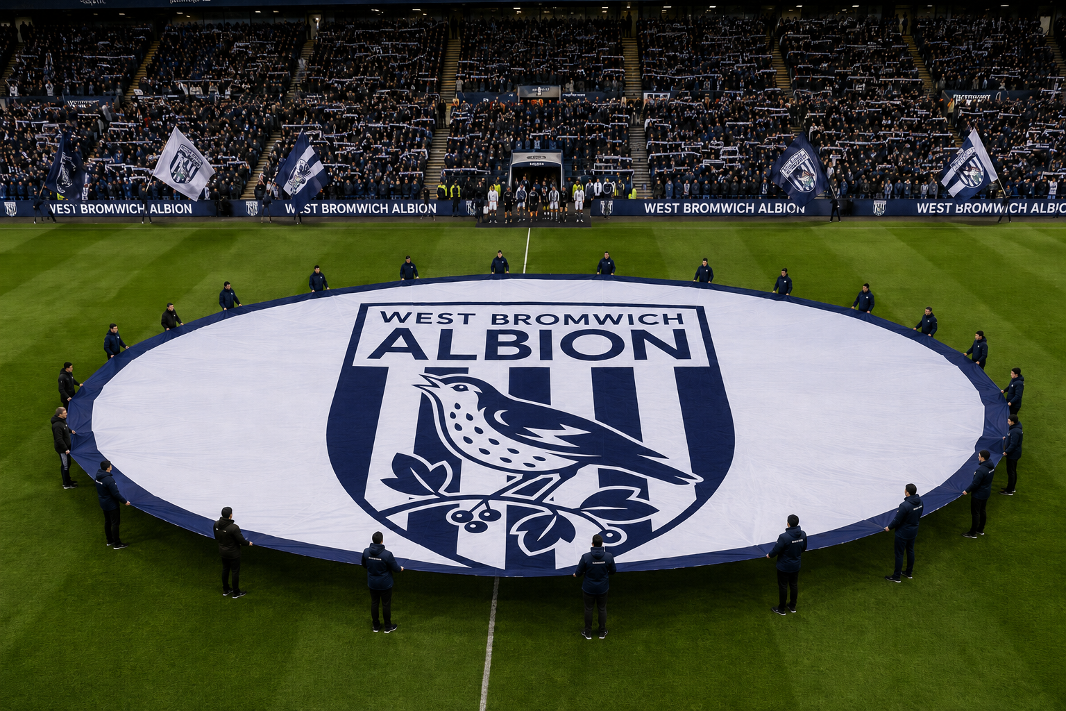
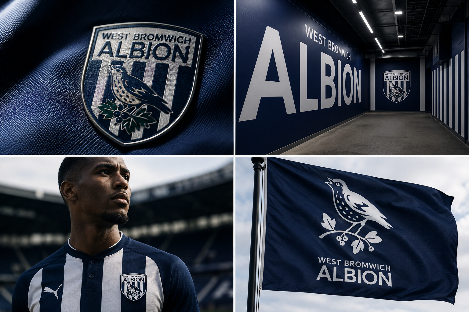
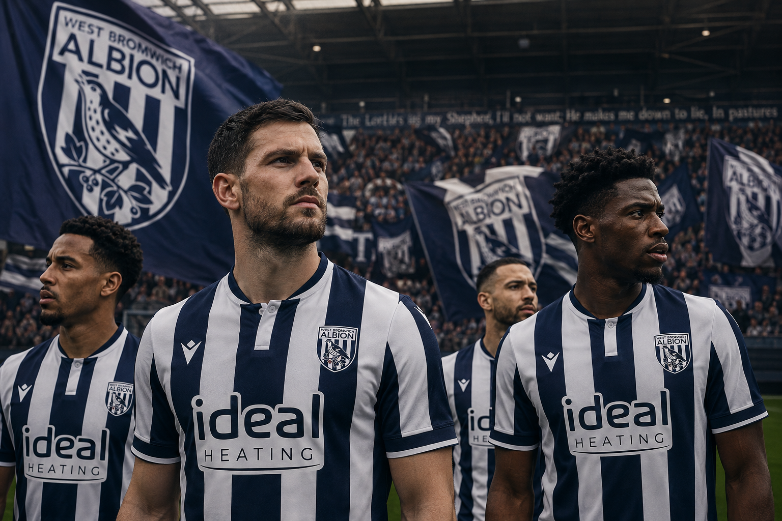
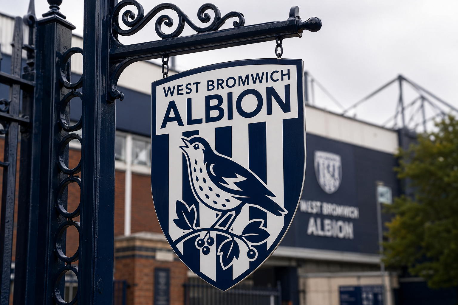
The value of the system is tested through application. Primary and secondary marks, Navy & White contrast, stripes and ALBION are allowed to shift in hierarchy depending on the environment while retaining one recognisable visual language.
LESS DETAIL.
MORE ALBION.
This identity proposal is not a move away from West Bromwich Albion’s past. It is an attempt to make the symbols built since 1878 — the Throstle, Hawthorn and Navy & White — work with greater clarity inside contemporary football culture.
West Bromwich Albion의 새로운 아이덴티티는 과거를 지우는 변화가 아닙니다. 1878년부터 축적된 Albion의 상징을 더 명확한 형태로 정제하고, Throstle과 Hawthorn, Navy & White Stripes가 가진 이야기를 오늘날의 축구 문화 안에서 다시 작동하도록 만드는 작업입니다. 디테일은 줄였지만, Albion은 더욱 선명해집니다.